
Berlin International Literature… - 图片创意预览

Berlin International Literature…

Berlin International Literature Festival and Berlinale style vertical poster, 9:16 ratio, cold detac

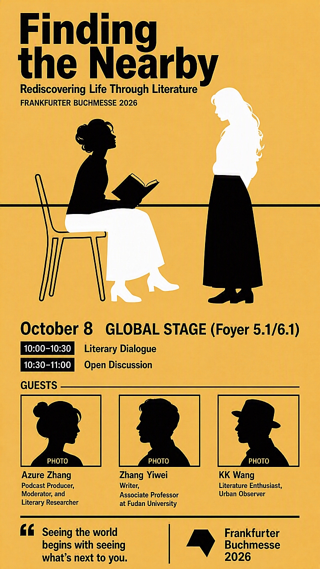
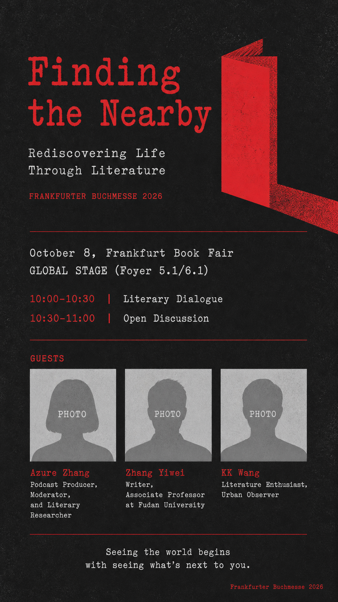
Berlin Literature Festival style artistic vertical poster, 9:16 ratio. Classic German poster design, bold and striking like Babylon cinema / Berlin theater posters. Color palette: Bright mustard yellow background + solid black figures and text. High contrast, bold, graphic, very Berlin, very Weimar Republic / Babylon Kino aesthetic. Clean, powerful, no gradients - pure yellow and black. Central visual: Keep the split horizontal composition with two figures facing each other, but reimagined in bold black-and-yellow graphic style. LEFT FIGURE (the reader with book): Bold black silhouette of a person sitting and reading an open book, wearing a beret, head tilted down. Graphic, clean silhouette style. The figure is on the left side. RIGHT FIGURE (the nearby stranger): Bold black outline silhouette - hollow/empty inside (the yellow background shows through), like a negative cutout shape. Standing, facing toward the reader figure (back to viewer). This represents the nearby stranger - present but unknown. A thin horizontal line cuts across the middle of both figures, creating the split composition effect. Above the line: yellow background with black figures. Below the line: the figures invert (the reader becomes yellow outline on black, the stranger becomes solid black). Wait no - keep it simpler and more graphic: just pure yellow background, two bold black figures, one solid (reader with book) and one hollow outline (stranger). The horizontal split line divides the poster into top and bottom halves, and the figures cross the line. Actually, make it more like classic German graphic design: pure bright yellow background, two bold black silhouettes facing each other in the center - one solid black figure reading a book (with beret), one hollow/outline figure (the stranger). A thin horizontal black line runs across the middle of the poster, passing through both figures. Clean, bold, graphic, very Berlin. All text in black, using bold sans-serif / grotesk font (classic German poster typography) - strong, clean, modernist. Some typewriter font accents for literary feel. TOP AREA (yellow background): - Main title large bold: "Finding the Nearby" - Subtitle: "Rediscovering Life Through Literature" - Small: "FRANKFURTER BUCHMESSE 2026" CENTRAL AREA: The two figures (solid reader + hollow stranger) with horizontal split line crossing through them. Graphic, bold, iconic. BOTTOM AREA (yellow background): - Event details: "October 8, Frankfurt Book Fair" "GLOBAL STAGE (Foyer 5.1/6.1)" - Agenda: "10:00-10:30 Literary Dialogue" "10:30-11:00 Open Discussion" GUEST SECTION: - Three guest portrait placeholder frames horizontally, simple black outline boxes with silhouette and "PHOTO" label - Names and titles: "Azure Zhang, Podcast Producer, Moderator, and Literary Researcher" "Zhang Yiwei, Writer, Associate Professor at Fudan University" "KK Wang, Literature Enthusiast, Urban Observer" BOTTOM: - Tagline: "Seeing the world begins with seeing what's next to you." - Bottom right: "Frankfurter Buchmesse 2026" Visual style: Classic German poster design - bright yellow + black, high contrast, bold graphic silhouettes, clean typography. Reminiscent of Babylon Kino Berlin, Weimar Republic poster design, Swiss/German graphic design. Strong, striking, intellectual, very Berlin. The solid vs hollow figure contrast perfectly represents the known reader vs the unknown nearby stranger. 画面中所有嘉宾头像区域使用简洁轮廓剪影占位符呈现,标注"PHOTO"字样,严禁生成任何真实人脸图像。 画面中所有信息区域、嘉宾介绍区、议程区等必须填充完整合理的内容,不得出现空白框、空白占位、横线待填写区域、空列表项、空单元格。 画面中所有数字必须精确渲染,不得错位、遗漏或编造。Berlin Literature Festival style artistic vertical poster, 9:16 ratio. Classic German poster design, bold and striking like Babylon cinema / Berlin theater posters.

Color palette: Bright mustard yellow background + solid black figures and text. High contrast, bold, graphic, very Berlin, very Weimar Republic / Babylon Kino aesthetic. Clean, powerful, no gradients - pure yellow and black.

Central visual: Keep the split horizontal composition with two figures facing each other, but reimagined in bold black-and-yellow graphic style.

LEFT FIGURE (the reader with book): Bold black silhouette of a person sitting and reading an open book, wearing a beret, head tilted down. Graphic, clean silhouette style. The figure is on the left side.

RIGHT FIGURE (the nearby stranger): Bold black outline silhouette - hollow/empty inside (the yellow background shows through), like a negative cutout shape. Standing, facing toward the reader figure (back to viewer). This represents the nearby stranger - present but unknown.

A thin horizontal line cuts across the middle of both figures, creating the split composition effect. Above the line: yellow background with black figures. Below the line: the figures invert (the reader becomes yellow outline on black, the stranger becomes solid black). Wait no - keep it simpler and more graphic: just pure yellow background, two bold black figures, one solid (reader with book) and one hollow outline (stranger). The horizontal split line divides the poster into top and bottom halves, and the figures cross the line.

Actually, make it more like classic German graphic design: pure bright yellow background, two bold black silhouettes facing each other in the center - one solid black figure reading a book (with beret), one hollow/outline figure (the stranger). A thin horizontal black line runs across the middle of the poster, passing through both figures. Clean, bold, graphic, very Berlin.

All text in black, using bold sans-serif / grotesk font (classic German poster typography) - strong, clean, modernist. Some typewriter font accents for literary feel.

TOP AREA (yellow background):
- Main title large bold: "Finding the Nearby"
- Subtitle: "Rediscovering Life Through Literature"
- Small: "FRANKFURTER BUCHMESSE 2026"

CENTRAL AREA: The two figures (solid reader + hollow stranger) with horizontal split line crossing through them. Graphic, bold, iconic.

BOTTOM AREA (yellow background):
- Event details:
  "October 8, Frankfurt Book Fair"
  "GLOBAL STAGE (Foyer 5.1/6.1)"
- Agenda:
  "10:00-10:30  Literary Dialogue"
  "10:30-11:00  Open Discussion"

GUEST SECTION:
- Three guest portrait placeholder frames horizontally, simple black outline boxes with silhouette and "PHOTO" label
- Names and titles:
  "Azure Zhang, Podcast Producer, Moderator, and Literary Researcher"
  "Zhang Yiwei, Writer, Associate Professor at Fudan University"
  "KK Wang, Literature Enthusiast, Urban Observer"

BOTTOM:
- Tagline: "Seeing the world begins with seeing what's next to you."
- Bottom right: "Frankfurter Buchmesse 2026"

Visual style: Classic German poster design - bright yellow + black, high contrast, bold graphic silhouettes, clean typography. Reminiscent of Babylon Kino Berlin, Weimar Republic poster design, Swiss/German graphic design. Strong, striking, intellectual, very Berlin. The solid vs hollow figure contrast perfectly represents the known reader vs the unknown nearby stranger.

画面中所有嘉宾头像区域使用简洁轮廓剪影占位符呈现,标注"PHOTO"字样,严禁生成任何真实人脸图像。
画面中所有信息区域、嘉宾介绍区、议程区等必须填充完整合理的内容,不得出现空白框、空白占位、横线待填写区域、空列表项、空单元格。
画面中所有数字必须精确渲染,不得错位、遗漏或编造。
创意 × 2
Berlin Literature Festival style artistic vertical poster, 9:16 ratio. Bright mustard yellow background + solid black, classic German Babylon Kino poster style. Keep everything exactly the same as before, make only these three precise adjustments: ADJUSTMENT 1: - Zhang Yiwei's entry: add a comma after "Writer". So it reads: "Writer," on the second line. Full entry: Line 1: "Zhang Yiwei" Line 2: "Writer," Line 3: "Associate Professor at Fudan University" ADJUSTMENT 2: - "GLOBAL STAGE (Foyer 5.1/6.1)" must be EXACTLY the same font size as "October 8". Absolutely identical size. Both are bold, both are the same height. They should look perfectly balanced side by side. Make sure GLOBAL STAGE is not smaller at all - match the size precisely. ADJUSTMENT 3: - The horizontal split line that cuts through both figures must be a SOLID BLACK LINE. Currently it appears yellow/invisible. It should be a clear, sharp black horizontal line running across the entire width of the poster, passing through both figures at their midsection, dividing them into top and bottom halves. This black line is what creates the split composition effect. Everything else stays exactly the same: - Left figure (reader with book and beret): top half solid black, bottom half hollow/outline (yellow shows through) - Right figure (stranger standing): top half hollow/outline (yellow shows through), bottom half solid black - All other text, layout, guest placeholders, tagline, branding remain unchanged. TOP AREA: - Main title large bold: "Finding the Nearby" - Subtitle: "Rediscovering Life Through Literature" - Small: "FRANKFURTER BUCHMESSE 2026" CENTRAL AREA: Two figures with a CLEAR BLACK HORIZONTAL LINE cutting through both at midsection. Left: solid top/hollow bottom. Right: hollow top/solid bottom. BOTTOM AREA: - Date and venue SAME EXACT SIZE, both bold: "October 8 GLOBAL STAGE (Foyer 5.1/6.1)" - Agenda: "10:00-10:30 Literary Dialogue" "10:30-11:00 Open Discussion" GUEST SECTION: - Column 1: PHOTO + "Azure Zhang, Podcast Producer, Moderator, and Literary Researcher" - Column 2: PHOTO + "Zhang Yiwei" + "Writer," + "Associate Professor at Fudan University" - Column 3: PHOTO + "KK Wang, Literature Enthusiast, Urban Observer" BOTTOM: - Tagline: "Seeing the world begins with seeing what's next to you." - Bottom right: "Frankfurter Buchmesse 2026" 画面中所有嘉宾头像区域使用简洁轮廓剪影占位符呈现,标注"PHOTO"字样,严禁生成任何真实人脸图像。 画面中所有信息区域、嘉宾介绍区、议程区等必须填充完整合理的内容,不得出现空白框、空白占位、横线待填写区域、空列表项、空单元格。 画面中所有数字必须精确渲染,不得错位、遗漏或编造。Berlin Literature Festival style artistic vertical poster, 9:16 ratio. Bright mustard yellow background + solid black, classic German Babylon Kino poster style. Keep everything exactly the same as before, make only these three precise adjustments:

ADJUSTMENT 1:
- Zhang Yiwei's entry: add a comma after "Writer". So it reads: "Writer," on the second line. Full entry:
  Line 1: "Zhang Yiwei"
  Line 2: "Writer,"
  Line 3: "Associate Professor at Fudan University"

ADJUSTMENT 2:
- "GLOBAL STAGE (Foyer 5.1/6.1)" must be EXACTLY the same font size as "October 8". Absolutely identical size. Both are bold, both are the same height. They should look perfectly balanced side by side. Make sure GLOBAL STAGE is not smaller at all - match the size precisely.

ADJUSTMENT 3:
- The horizontal split line that cuts through both figures must be a SOLID BLACK LINE. Currently it appears yellow/invisible. It should be a clear, sharp black horizontal line running across the entire width of the poster, passing through both figures at their midsection, dividing them into top and bottom halves. This black line is what creates the split composition effect.

Everything else stays exactly the same:
- Left figure (reader with book and beret): top half solid black, bottom half hollow/outline (yellow shows through)
- Right figure (stranger standing): top half hollow/outline (yellow shows through), bottom half solid black
- All other text, layout, guest placeholders, tagline, branding remain unchanged.

TOP AREA:
- Main title large bold: "Finding the Nearby"
- Subtitle: "Rediscovering Life Through Literature"
- Small: "FRANKFURTER BUCHMESSE 2026"

CENTRAL AREA: Two figures with a CLEAR BLACK HORIZONTAL LINE cutting through both at midsection. Left: solid top/hollow bottom. Right: hollow top/solid bottom.

BOTTOM AREA:
- Date and venue SAME EXACT SIZE, both bold: "October 8    GLOBAL STAGE (Foyer 5.1/6.1)"
- Agenda:
  "10:00-10:30  Literary Dialogue"
  "10:30-11:00  Open Discussion"

GUEST SECTION:
- Column 1: PHOTO + "Azure Zhang, Podcast Producer, Moderator, and Literary Researcher"
- Column 2: PHOTO + "Zhang Yiwei" + "Writer," + "Associate Professor at Fudan University"
- Column 3: PHOTO + "KK Wang, Literature Enthusiast, Urban Observer"

BOTTOM:
- Tagline: "Seeing the world begins with seeing what's next to you."
- Bottom right: "Frankfurter Buchmesse 2026"

画面中所有嘉宾头像区域使用简洁轮廓剪影占位符呈现,标注"PHOTO"字样,严禁生成任何真实人脸图像。
画面中所有信息区域、嘉宾介绍区、议程区等必须填充完整合理的内容,不得出现空白框、空白占位、横线待填写区域、空列表项、空单元格。
画面中所有数字必须精确渲染,不得错位、遗漏或编造。
创意 × 2
Berlin Literature Festival style artistic vertical poster, 9:16 ratio. Bright mustard yellow background + solid black, classic German Babylon Kino poster style. Keep everything exactly the same as before, make only these three precise adjustments: ADJUSTMENT 1: - Zhang Yiwei's entry: add a comma after "Writer". So it reads: "Writer," on the second line. Full entry: Line 1: "Zhang Yiwei" Line 2: "Writer," Line 3: "Associate Professor at Fudan University" ADJUSTMENT 2: - "GLOBAL STAGE (Foyer 5.1/6.1)" must be EXACTLY the same font size as "October 8". Absolutely identical size. Both are bold, both are the same height. They should look perfectly balanced side by side. Make sure GLOBAL STAGE is not smaller at all - match the size precisely. ADJUSTMENT 3: - The horizontal split line that cuts through both figures must be a SOLID BLACK LINE. Currently it appears yellow/invisible. It should be a clear, sharp black horizontal line running across the entire width of the poster, passing through both figures at their midsection, dividing them into top and bottom halves. This black line is what creates the split composition effect. Everything else stays exactly the same: - Left figure (reader with book and beret): top half solid black, bottom half hollow/outline (yellow shows through) - Right figure (stranger standing): top half hollow/outline (yellow shows through), bottom half solid black - All other text, layout, guest placeholders, tagline, branding remain unchanged. TOP AREA: - Main title large bold: "Finding the Nearby" - Subtitle: "Rediscovering Life Through Literature" - Small: "FRANKFURTER BUCHMESSE 2026" CENTRAL AREA: Two figures with a CLEAR BLACK HORIZONTAL LINE cutting through both at midsection. Left: solid top/hollow bottom. Right: hollow top/solid bottom. BOTTOM AREA: - Date and venue SAME EXACT SIZE, both bold: "October 8 GLOBAL STAGE (Foyer 5.1/6.1)" - Agenda: "10:00-10:30 Literary Dialogue" "10:30-11:00 Open Discussion" GUEST SECTION: - Column 1: PHOTO + "Azure Zhang, Podcast Producer, Moderator, and Literary Researcher" - Column 2: PHOTO + "Zhang Yiwei" + "Writer," + "Associate Professor at Fudan University" - Column 3: PHOTO + "KK Wang, Literature Enthusiast, Urban Observer" BOTTOM: - Tagline: "Seeing the world begins with seeing what's next to you." - Bottom right: "Frankfurter Buchmesse 2026" 画面中所有嘉宾头像区域使用简洁轮廓剪影占位符呈现,标注"PHOTO"字样,严禁生成任何真实人脸图像。 画面中所有信息区域、嘉宾介绍区、议程区等必须填充完整合理的内容,不得出现空白框、空白占位、横线待填写区域、空列表项、空单元格。 画面中所有数字必须精确渲染,不得错位、遗漏或编造。Berlin Literature Festival style artistic vertical poster, 9:16 ratio. Bright mustard yellow background + solid black, classic German Babylon Kino poster style. Keep everything exactly the same as before, make only these three precise adjustments:

ADJUSTMENT 1:
- Zhang Yiwei's entry: add a comma after "Writer". So it reads: "Writer," on the second line. Full entry:
  Line 1: "Zhang Yiwei"
  Line 2: "Writer,"
  Line 3: "Associate Professor at Fudan University"

ADJUSTMENT 2:
- "GLOBAL STAGE (Foyer 5.1/6.1)" must be EXACTLY the same font size as "October 8". Absolutely identical size. Both are bold, both are the same height. They should look perfectly balanced side by side. Make sure GLOBAL STAGE is not smaller at all - match the size precisely.

ADJUSTMENT 3:
- The horizontal split line that cuts through both figures must be a SOLID BLACK LINE. Currently it appears yellow/invisible. It should be a clear, sharp black horizontal line running across the entire width of the poster, passing through both figures at their midsection, dividing them into top and bottom halves. This black line is what creates the split composition effect.

Everything else stays exactly the same:
- Left figure (reader with book and beret): top half solid black, bottom half hollow/outline (yellow shows through)
- Right figure (stranger standing): top half hollow/outline (yellow shows through), bottom half solid black
- All other text, layout, guest placeholders, tagline, branding remain unchanged.

TOP AREA:
- Main title large bold: "Finding the Nearby"
- Subtitle: "Rediscovering Life Through Literature"
- Small: "FRANKFURTER BUCHMESSE 2026"

CENTRAL AREA: Two figures with a CLEAR BLACK HORIZONTAL LINE cutting through both at midsection. Left: solid top/hollow bottom. Right: hollow top/solid bottom.

BOTTOM AREA:
- Date and venue SAME EXACT SIZE, both bold: "October 8    GLOBAL STAGE (Foyer 5.1/6.1)"
- Agenda:
  "10:00-10:30  Literary Dialogue"
  "10:30-11:00  Open Discussion"

GUEST SECTION:
- Column 1: PHOTO + "Azure Zhang, Podcast Producer, Moderator, and Literary Researcher"
- Column 2: PHOTO + "Zhang Yiwei" + "Writer," + "Associate Professor at Fudan University"
- Column 3: PHOTO + "KK Wang, Literature Enthusiast, Urban Observer"

BOTTOM:
- Tagline: "Seeing the world begins with seeing what's next to you."
- Bottom right: "Frankfurter Buchmesse 2026"

画面中所有嘉宾头像区域使用简洁轮廓剪影占位符呈现,标注"PHOTO"字样,严禁生成任何真实人脸图像。
画面中所有信息区域、嘉宾介绍区、议程区等必须填充完整合理的内容,不得出现空白框、空白占位、横线待填写区域、空列表项、空单元格。
画面中所有数字必须精确渲染,不得错位、遗漏或编造。
创意 × 2
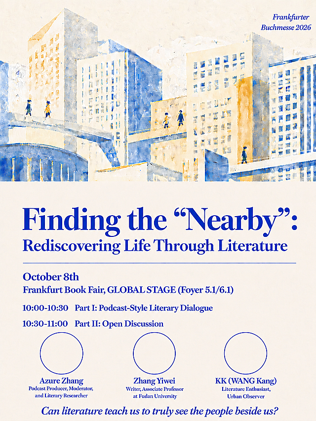
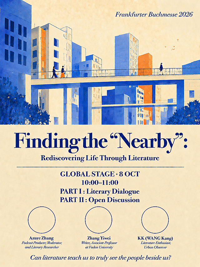
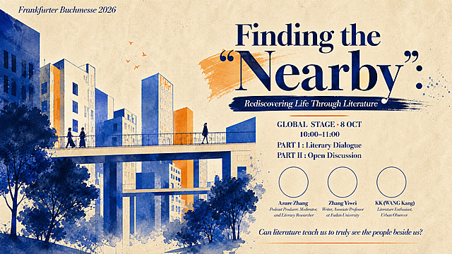
3:4竖版文学活动海报,颗粒质感扁平插画风格,类似Ryo Takemasa插画风格,色块平涂+噪点颗粒纹理。 配色:奶油米白底 + 克莱因蓝 + 暖橙色点缀,三色搭配,文艺温暖。 画面构图(竖版3:4): - 上半部分约55%:城市建筑插画场景——错落的高楼建筑,克莱因蓝和米白色块构成,建筑之间有连廊天桥,天桥上有几个小人物在行走,天空是米白色带颗粒纹理 - 右上角:淡淡的克莱因蓝德语文字 "Frankfurter Buchmesse 2026",低调融入背景 - 下半部分约45%:文字信息区,奶油米白底 文字内容(克莱因蓝 Bodoni 衬线字体): - 主标题(超大粗体):"Finding the "Nearby":" —— Nearby带弯引号,末尾有冒号 - 副标题:"Rediscovering Life Through Literature" - 一条细细的克莱因蓝横线 横线下方四行信息,严格等间距排列,每行之间的距离完全相等,均匀对称: - "October 8th" - "Frankfurt Book Fair, GLOBAL STAGE (Foyer 5.1/6.1)" - "10:00-10:30 Part I: Podcast-Style Literary Dialogue" - "10:30-11:00 Part II: Open Discussion" 再往下是三个等大的圆形轮廓(克莱因蓝细线勾勒,圈内留白),横向均匀排列: - 左圆下:"Azure Zhang / Podcast Producer, Moderator, and Literary Researcher" - 中圆下:"Zhang Yiwei / Writer, Associate Professor at Fudan University" - 右圆下:"KK (WANG Kang) / Literature Enthusiast, Urban Observer" 最底部:"Can literature teach us to truly see the people beside us?"(Bodoni斜体) 重点要求:横线下方的四行信息文字,行与行之间的垂直间距必须完全相等,严格对称,第一行到第二行 = 第二行到第三行 = 第三行到第四行,三个间距一模一样。 整体气质文艺温暖,像独立出版社文学活动海报。版式精美,层次分明。所有数字精确渲染。3:4竖版文学活动海报,颗粒质感扁平插画风格,类似Ryo Takemasa插画风格,色块平涂+噪点颗粒纹理。

配色:奶油米白底 + 克莱因蓝 + 暖橙色点缀,三色搭配,文艺温暖。

画面构图(竖版3:4):
- 上半部分约55%:城市建筑插画场景——错落的高楼建筑,克莱因蓝和米白色块构成,建筑之间有连廊天桥,天桥上有几个小人物在行走,天空是米白色带颗粒纹理
- 右上角:淡淡的克莱因蓝德语文字 "Frankfurter Buchmesse 2026",低调融入背景
- 下半部分约45%:文字信息区,奶油米白底

文字内容(克莱因蓝 Bodoni 衬线字体):
- 主标题(超大粗体):"Finding the "Nearby":" —— Nearby带弯引号,末尾有冒号
- 副标题:"Rediscovering Life Through Literature"
- 一条细细的克莱因蓝横线

横线下方四行信息,严格等间距排列,每行之间的距离完全相等,均匀对称:
- "October 8th"
- "Frankfurt Book Fair, GLOBAL STAGE (Foyer 5.1/6.1)"
- "10:00-10:30  Part I: Podcast-Style Literary Dialogue"
- "10:30-11:00  Part II: Open Discussion"

再往下是三个等大的圆形轮廓(克莱因蓝细线勾勒,圈内留白),横向均匀排列:
- 左圆下:"Azure Zhang / Podcast Producer, Moderator, and Literary Researcher"
- 中圆下:"Zhang Yiwei / Writer, Associate Professor at Fudan University"
- 右圆下:"KK (WANG Kang) / Literature Enthusiast, Urban Observer"

最底部:"Can literature teach us to truly see the people beside us?"(Bodoni斜体)

重点要求:横线下方的四行信息文字,行与行之间的垂直间距必须完全相等,严格对称,第一行到第二行 = 第二行到第三行 = 第三行到第四行,三个间距一模一样。

整体气质文艺温暖,像独立出版社文学活动海报。版式精美,层次分明。所有数字精确渲染。
一张文学沙龙活动海报,竖版3:4比例,美术生审美,文学感强烈,面向00后年轻群体,排版舒服自然,色彩协调。 【版式参考】参考图2和图3的左文右图版式骨架:左侧为文字信息区,右侧为抽象主视觉区;保留图2的嘉宾头像+姓名+身份的纵向排列方式,保留图3的时间地点图标化信息排版。 【风格参考】参考图1的抽象艺术氛围:横向笔触条纹质感,暖橙-粉紫-青蓝渐变色带,黑色负空间,一个孤独人物剪影走向光的方向,象征"附近的消失与重新发现"。 【画面分区】 - 顶部左侧:小字英文装饰"LITERATURE SALON",下方主标题"寻找'附近'",字号最大,衬线字体,深棕色 - 主标题下方:副标题"在文学中重新看见生活",字号次之 - 副标题下方:关键词标签横排"附近 · 陌生人速写 · 播客现场 · 即兴 · 参与式",细线条分隔 - 中部左侧:嘉宾区标题"嘉宾 /",下方纵向排列三位嘉宾,每位配圆形头像占位框(灰色圆形占位,标注"照片")+ 姓名 + 身份简介: 1. 张怡微(中国青年作家) 2. 阿酌("痴人之爱"文学播客主播) 3. KK(留德文学爱好者) - 嘉宾区下方:时间区标题"时间 /",下方大字"10月8日",旁边小字"10:00-11:00" - 时间区下方:地点区标题"地点 /",配定位图标,文字"法兰克福书展 GLOBAL STAGE" - 右下角:二维码占位符,纯色方块中央标注"二维码占位"文字 - 最底部:一行小字"城市不是布景,是一种介质" 【右侧主视觉】参考图1风格的抽象艺术画面:横向排列的笔触条纹,从顶部青蓝渐变到中部暖橙再到底部粉紫,右侧大面积黑色负空间,一个小小的人物剪影站在色彩与黑暗的交界处,朝向黑色深处走去,营造孤独又诗意的氛围,象征"附近"的探索。条纹有手绘质感,边缘不规则,像一层层书页或记忆。 【配色】整体暖调文学感:米白/浅米色背景,深棕色标题文字,暖橙+粉紫+青蓝的抽象主视觉色块,金色细线条点缀,莫兰迪色系,低饱和度,高级雅致。 【字体】主标题用优雅衬线宋体,副标题用细黑体,正文用常规黑体,嘉宾姓名加粗,数字用大号衬线体突出。 【氛围】安静、诗意、有思考深度,文学气息浓厚,像一本书的封面,适合年轻文艺青年审美。 画面中所有数字必须精确渲染,不得错位、遗漏或编造。画面中所有信息区域、嘉宾介绍区必须填充完整合理的内容,不得出现空白框。画面中二维码区域使用纯色方块占位符呈现,方块中央标注"二维码占位"文字,严禁生成任何可识别的二维码图案。版式精美,四边留足安全边距。一张文学沙龙活动海报,竖版3:4比例,美术生审美,文学感强烈,面向00后年轻群体,排版舒服自然,色彩协调。

【版式参考】参考图2和图3的左文右图版式骨架:左侧为文字信息区,右侧为抽象主视觉区;保留图2的嘉宾头像+姓名+身份的纵向排列方式,保留图3的时间地点图标化信息排版。

【风格参考】参考图1的抽象艺术氛围:横向笔触条纹质感,暖橙-粉紫-青蓝渐变色带,黑色负空间,一个孤独人物剪影走向光的方向,象征"附近的消失与重新发现"。

【画面分区】
- 顶部左侧:小字英文装饰"LITERATURE SALON",下方主标题"寻找'附近'",字号最大,衬线字体,深棕色
- 主标题下方:副标题"在文学中重新看见生活",字号次之
- 副标题下方:关键词标签横排"附近 · 陌生人速写 · 播客现场 · 即兴 · 参与式",细线条分隔
- 中部左侧:嘉宾区标题"嘉宾 /",下方纵向排列三位嘉宾,每位配圆形头像占位框(灰色圆形占位,标注"照片")+ 姓名 + 身份简介:
  1. 张怡微(中国青年作家)
  2. 阿酌("痴人之爱"文学播客主播)
  3. KK(留德文学爱好者)
- 嘉宾区下方:时间区标题"时间 /",下方大字"10月8日",旁边小字"10:00-11:00"
- 时间区下方:地点区标题"地点 /",配定位图标,文字"法兰克福书展 GLOBAL STAGE"
- 右下角:二维码占位符,纯色方块中央标注"二维码占位"文字
- 最底部:一行小字"城市不是布景,是一种介质"

【右侧主视觉】参考图1风格的抽象艺术画面:横向排列的笔触条纹,从顶部青蓝渐变到中部暖橙再到底部粉紫,右侧大面积黑色负空间,一个小小的人物剪影站在色彩与黑暗的交界处,朝向黑色深处走去,营造孤独又诗意的氛围,象征"附近"的探索。条纹有手绘质感,边缘不规则,像一层层书页或记忆。

【配色】整体暖调文学感:米白/浅米色背景,深棕色标题文字,暖橙+粉紫+青蓝的抽象主视觉色块,金色细线条点缀,莫兰迪色系,低饱和度,高级雅致。

【字体】主标题用优雅衬线宋体,副标题用细黑体,正文用常规黑体,嘉宾姓名加粗,数字用大号衬线体突出。

【氛围】安静、诗意、有思考深度,文学气息浓厚,像一本书的封面,适合年轻文艺青年审美。

画面中所有数字必须精确渲染,不得错位、遗漏或编造。画面中所有信息区域、嘉宾介绍区必须填充完整合理的内容,不得出现空白框。画面中二维码区域使用纯色方块占位符呈现,方块中央标注"二维码占位"文字,严禁生成任何可识别的二维码图案。版式精美,四边留足安全边距。